
I prefer Gemara (or “Tz’enah U’re’enah”) typeface, myself. Ah, but maybe the difficulty helps the reader retain the content itself…
See, a new, “scientifically-tested” font called Sans Forgetica is designed to force you to read slowly, so you don’t forget as fast (“Sans” in the sense of “without”. Get it?).
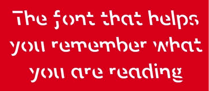
It looks like this:
The background:
The font was developed using a learning principle called ‘desirable difficulty’, where an obstruction is added to the learning process that requires us to put in just enough effort, leading to better memory retention to promote deeper cognitive processing. However, if a font is too different, the brain can’t process it and the information is not retained. Sans Forgetica lies at a sweet spot where just enough obstruction has been added to create that memory retention.
It was developed in a collaboration between typographic design specialist and psychologists, combining psychological theory and design principles to improve retention of written information.
They then tested their theory on the font (although the testing wasn’t long-term; what happens when they get used to it?):
About 400 university students have been involved in a study that found a small increase in the amount participants remembered – 57% of text written in Sans Forgetica compared with 50% in a plain Arial.
Maybe Rashi script achieves the same result. Maybe.
(Sans Forgetica is available for free here, by the way.)